Sun Country Airlines
A Rebranding Exercise
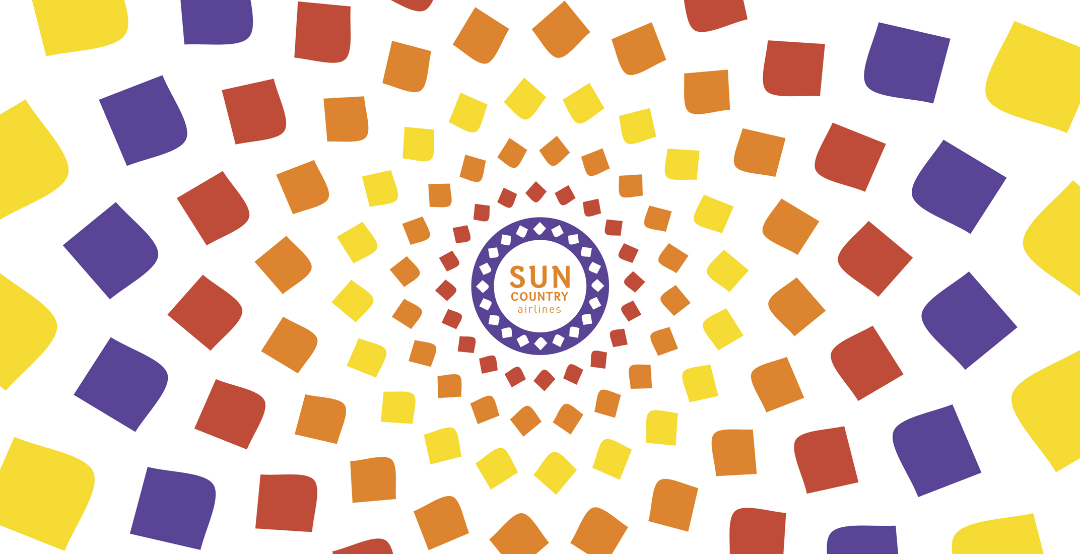
A rebranding exercise intended to showcase a new logo and identity system for Sun Country Airlines.
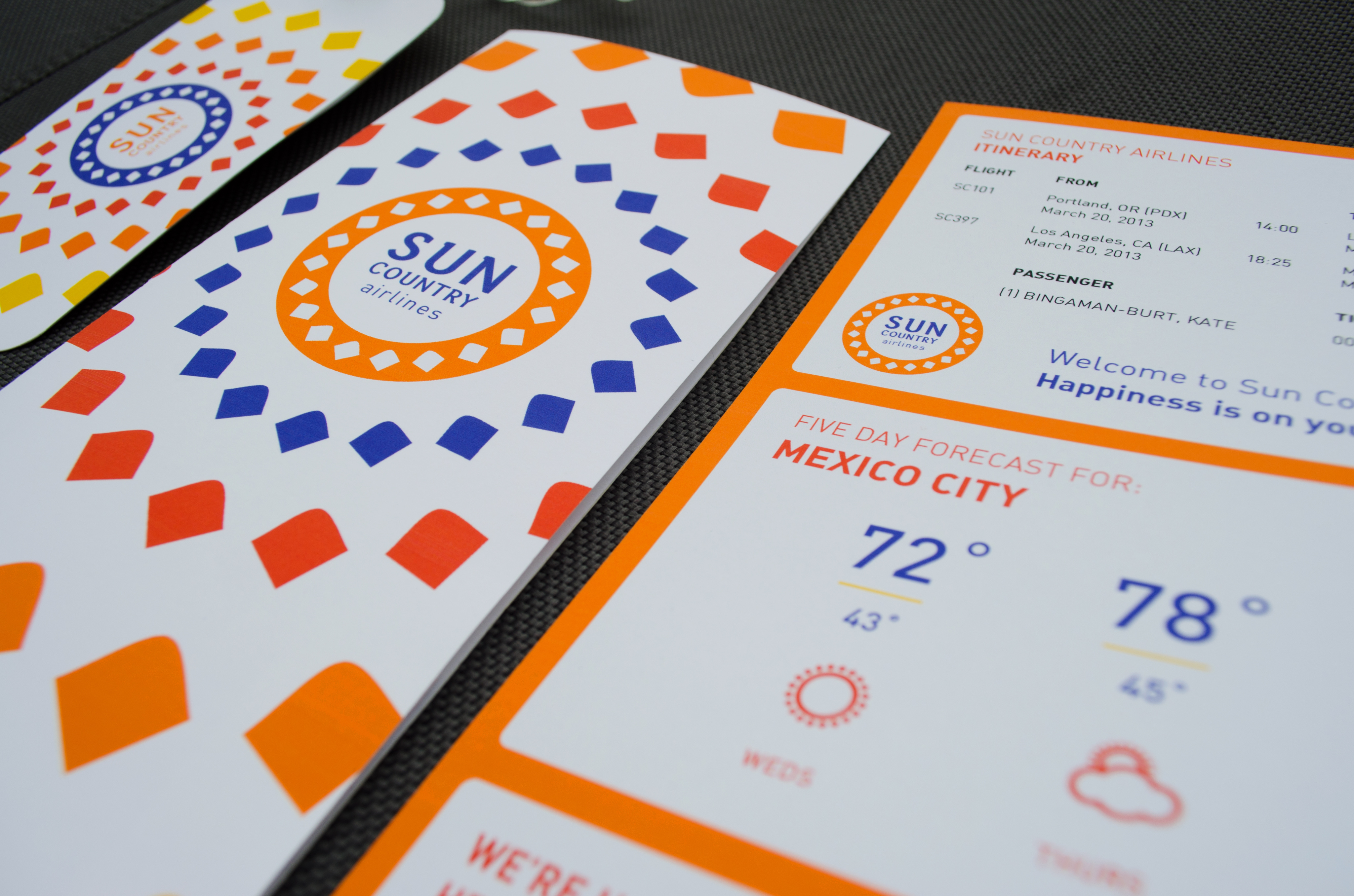
The new brand focuses on creating happiness through cheerful geometry and color, representing the superior customer service that the brand provides. The new brand is bright, bold, friendly and welcoming, and features language designed to attract and retain customers.
The system includes boarding passes, luggage tags, traditional advertising, as well as proposed website and mobile app designs
This was a student project from a Communication Design Studio taught by Kate Bingaman-Burt at PSU.
A Rebranding Exercise
A rebranding exercise intended to showcase a new logo and identity system for Sun Country Airlines.
The new brand focuses on creating happiness through cheerful geometry and color, representing the superior customer service that the brand provides. The new brand is bright, bold, friendly and welcoming, and features language designed to attract and retain customers.
The system includes boarding passes, luggage tags, traditional advertising, as well as proposed website and mobile app designs
This was a student project from a Communication Design Studio taught by Kate Bingaman-Burt at PSU.