The KEEN Family Center
The KEEN Family Center came to us with a challenge: they wanted to leave their former identity as “KEEN Kids Care” behind and create a new brand that better represented their work as an inclusive family space. The goal was to create a flexible system that encompassed organic, playful elements that related to both their educational philosophies and their nature-inspired space.
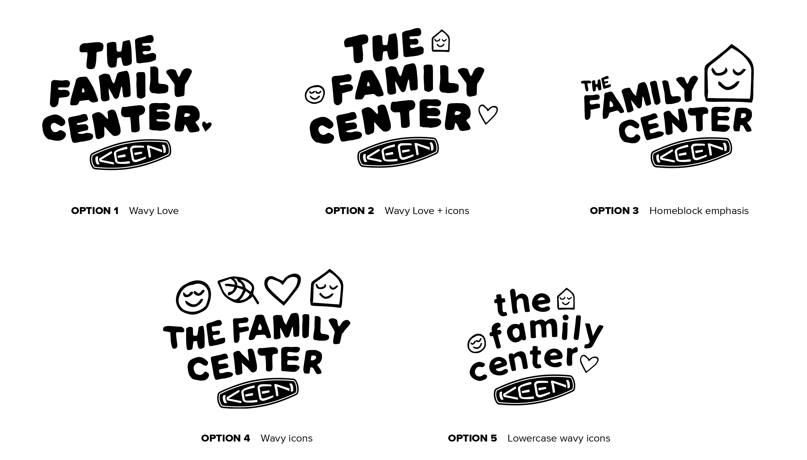
I presented multiple rounds of logos and the clients selected the final mark. The next step in the process was an intial color and pattern exploration.
The project was ultimately placed on hold in April 2020, prior to finalizing the branding system.
THE SELECTED MARK

LOGO OPTIONS

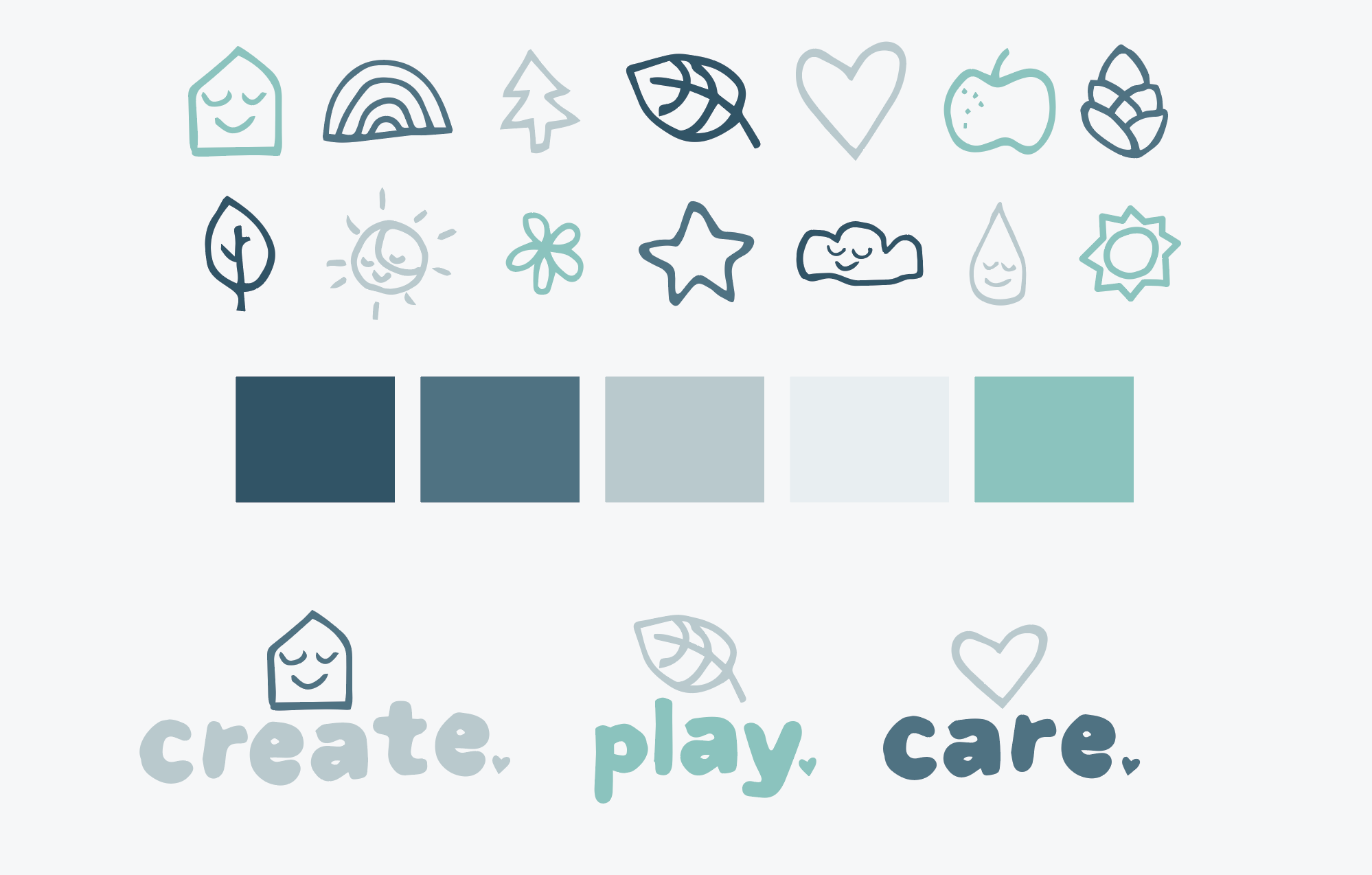
ICON SET AND COLOR PALETTE

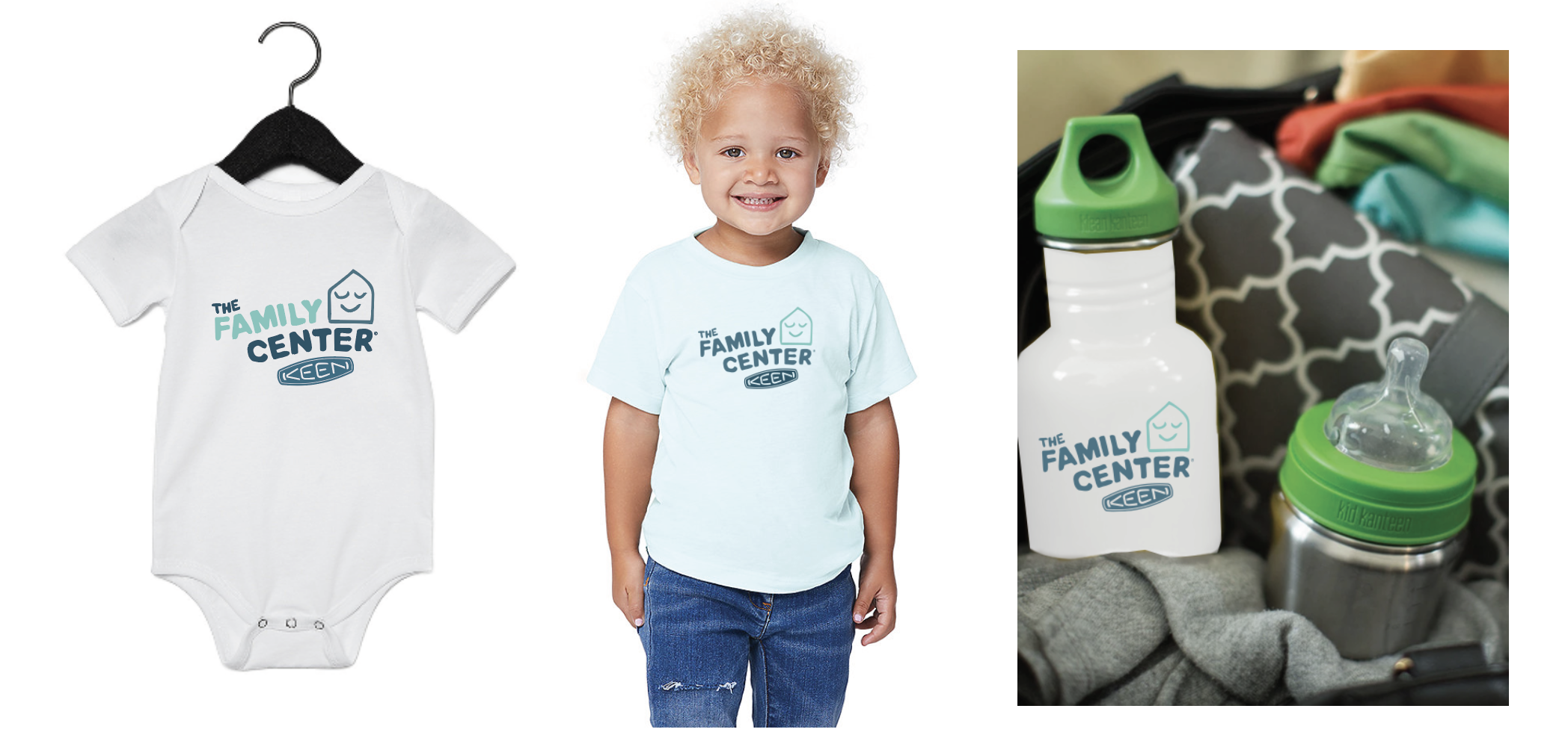
MERCH IDEAS

ILLUSTRATIVE PATTERNS


